This URL will soon be deprecated. Please find the Release Notes in our new directory. Go to Release Notes for iteration 25
Iteration 25: Apr 02 - Apr 22
A Unified Vision
In the past sprint, we focused on bridging the gap between design and development with the introduction of component and styles overview pages. This update provides a unified space that streamlines collaboration and makes it effortless for consumers to navigate and utilize the system. Alongside this, we placed a strong emphasis on accessibility, implementing key improvements to ensure our components and workflows are not only more inclusive but also empower all users to interact with the system seamlessly and effectively.
Advancing Accessibility
Our commitment to making Solid Components more accessible and inclusive remains a top priority. In this iteration, we implemented a range of accessibility improvements across multiple components. Key updates include:
Refactoring the HTML structure of the sd-teaser for better semantic alignment.
Enhancing screen reader announcements for components such as sd-notification, sd-scrollable, sd-carousel, and others.
Improving sd-select and sd-combobox to ensure compatibility with TalkBack users.
Adding missing focus states to enhance keyboard navigation and usability.
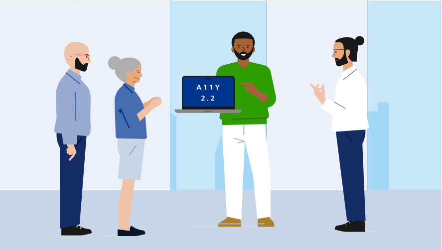
With these updates, our components and styles in the design system are compliant with WCAG 2.2 standards, ensuring an inclusive and accessible experience for all users. These updates reflect our ongoing efforts to ensure that Solid Components meet the highest accessibility standards.
Introducing Component Overview Pages
We are excited to mirror our component overview pages from Figma to Storybook. Each component now has its own dedicated page, providing a centralized resource for common use cases, usage guidelines, accessibility information, and relevant links.
This initiative aims to bridge the gap between code and design, creating a unified space that combines essential information for both developers and designers. By aligning these perspectives, we strive to foster collaboration and streamline workflows.
Expanded and Improved Templates Collection
This release brings significant enhancements to our templates collection. We have refined existing templates to make them more accessible and introduced new templates to address a broader range of use cases. Many of these templates are already available in Storybook, while others are in development and can be previewed in Figma.
Strengthening Brand Alignment
To ensure consistency and alignment with our brand identity, we addressed minor inconsistencies in colors and margins. These adjustments reinforce a cohesive and polished visual experience across all components.
Locked Aspect Ratio for icons
In Figma, we’ve applied aspect ratio lock to all content, social media, and system icons for improved visual consistency. This ensures better usability, accessibility, and scalability across all screen sizes.