Bringing Solid to Life
Our latest release brings the Solid Design System to life with thoughtfully crafted motion. Most components now feature seamless animations and micro-interactions that incorporate our brand motion principles, making every interaction feel much more on brand. These enhancements go beyond visual appeal—motion now helps guide users and clarify state changes in a way that feels both natural and delightful, while ensuring that interacting with our components is a distinctly branded experience.
But that’s not all—this release also includes other exciting updates and improvements across the system. Dive into the details below to discover everything new in this iteration!
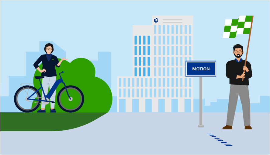
Bringing Components to Life: Motion Now Available
We’re excited to announce that we’re in the final stages of integrating motion design into our Solid Design System components in Storybook. This project centers on delivering improved, branded interactions—making every component feel more intuitive and ensuring each experience is distinctly aligned with our brand identity. Our goal is to provide smoother, on-brand interactions that elevate the experience for everyone.
What to expect:
-
Modern, Engaging Interactions: Components now feature thoughtfully designed animations and transitions to create a more dynamic and enjoyable user experience.
-
Enhanced Usability: Motion helps guide users through interactions, clarifying state changes and drawing attention to important actions.
-
Performance Optimized: Animations are designed to be smooth and efficient, ensuring a seamless experience across devices..
We’re nearing completion on all motion improvements. Stay tuned as we finalize the last updates. Explore these improvements live in Storybook and experience the transformation for yourself!
Start Strong: Fresh Updates to Getting Started
The Getting Started section has been improved to enhance navigation and streamline access to resources. Key updates include:
-
New Figma Library Section: Added direct links to our Figma docs for quicker access.
-
New Support Section: Added a dedicated area for bug reporting and questions.
-
Improved Layouts: Using Solid DS components and added more links.
These updates will help you find information faster and navigate between the Solid DS – Component Library and Component Docs with ease.
Next-Level Forms: Improved Templates & User Guidance
We’ve updated the Forms section in the Solid Design System to provide clearer guidance and improved usability for both designers and developers. This update aims to reduce guesswork, ensure accessibility, and streamline implementation.
Expanding our Design Templates
Our Figma library keeps expanding with new and refreshed templates, now featuring realistic content and best practices for faster, more effective project work. These updates will appear first in Figma and soon be synced with Storybook and code.
Advancing Accessibility
As part of our continued focus on accessibility, we've made updates to ensure Solid Components are more inclusive and easier to use for everyone. This includes improvements to components like sd-header and sd-bagde, where we refined the structure and behavior to better support screen readers and accessibility best practices. There updates help create a more consistent and accessible experience across the entire design system.
Reliability and clarity: ensuring quality across the system
To ensure a smooth and reliable user experience, we addressed some smaller issues related with events handling. Additionally, we renamed one of our icon libraries to improve clarity and make it easier for users to identify the source of the icons. This change enhances usability and aligns with our goal of providing a more intuitive and user-friendly design system.